Monday, 27 December 2010
Trailer storyboard-Photoshoot
Wednesday, 1 December 2010
Inital ideas: Posters & websites
I have sketch and annotated 3 poster designs:

Poster design two:
Poster design three:

I then went on to sketch and annotated 3 website designs:
Thursday, 18 November 2010
Site Map
Summary Of Analysis
5 typical conventions used in posters, trailers and websites for horror films:
Posters:
1. The images used and how they are postioned make the audience feel uncomfortable and they can tell that it is a horror by the way the models are positioned.
2. Dark backgrounds with big bold copy or the opposite therefore they contrast well together and are very bold and eye catching to the audeince.
3. Realese date and reviews are mainly always included.
4. Main characters names are postioned mainly at the bottom of the page and sometimes in the top corner, encourages the audience to watch the film.
5. The copy theme flows with the film style and colour theme used throughout.
Trailers:
1. The genre can be recorgnized shortly after the trailer begins.
2. Close up camera shots to increase emotions, actions and the atmoshpere
3. Only parts of the story are given away, mostly the exciting and intresting parts, therefore keeping the audienced hooked, intrested and wanting to watch the film.
4. Long shots, giving the audience a feel of the place and to add the atmosphere of the film genre.
5. Dark, dull colours used therefore representing that it is a horror film, also red is used a lot which represents, blood and death and also evil.
Websites:
1. Extra information is given, to encourage people to watch the film such as gallery, hirstory, videos and plot.
2. Trailer tends to be the first thing that is shown on the website homepage.
3. Links to other websites such as different social website, tickets, showing times and dates.
4. Release dates and many reviews included to encourge people to watch the film as a result of the good reviews.
5. Production company logos always included at the bottom of the website
Textual analysis-websites
Tuesday, 2 November 2010
Textual Analysis- Posters
'The Last Exorcism' poster analysis:

Textual Analysis- Trailers


Media Presentation
For our A2 media course we will be designing and creating a trailer for a film idea, also a poster of that film and a website.
Below me and my group have created a presentation on prezi.com of our 'film idea' which includes information on our genre, target audience, characters, tordorvs theory etc.
please click on the link below, to access our presentation.
http://prezi.com/lkzmt97lc
A2 course
Wednesday, 5 May 2010
Candidate details
Candidate number: 6286
Centre name: John F Kennedy School
Centre number: 17131
Tuesday, 6 April 2010
Evaluation
Tuesday, 23 March 2010
Thursday, 18 March 2010
Tuesday, 16 March 2010
Changes I have made, since my original designs

Photographs that have been edited for each section of the magazine
Thursday, 11 March 2010
Masthead style ideas
Double page spread copy and layout
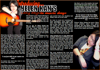
 To develop my double page spread further and to make it more effective and eye catching too readers, I decided to put parts of the copy in bold to make it more eye catching, and I made sure the copy I put in bold was intresting and that it would make readers intresting in what the artice is about. I also put the quotes in a larger font also to draw readers to the article.
Tuesday, 9 March 2010
Design ideas for; Front Cover, Contents Page and Double Page Spread
Two help me to develop my music magazine; I have produced two design ideas for my front cover, page and a double page spread. To help me further I have analysised each one, showing why each part works, this will allow me to expand on these designs so I can see if anything needs to be improved or changed.
Front cover design one:


