Tuesday, 23 March 2010
Thursday, 18 March 2010
Tuesday, 16 March 2010
Changes I have made, since my original designs
Throughout the development of my magazine, I have made a few small changes to my Front Cover & Double Page Spread, from when I first began making these pages. And the changes made to each one are linked to each other, as my Spread changed slightly because of my front cover style.
Previous design & Final Design

Previous Design & Final Design
Photographs that have been edited for each section of the magazine
For all the photographs I have used in making my music magazine, I have had to edit them to make them more effective and more striking then when they were orginally taken.
Thursday, 11 March 2010
Masthead style ideas
To help me to develop my music magazine cover further, I have come up with two different masthead designs.
Double page spread copy and layout
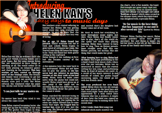
Here is the first draft of my double page spread with out the images. To develop my double page spread further and to make it more effective and eye catching too readers, I decided to put parts of the copy in bold to make it more eye catching, and I made sure the copy I put in bold was intresting and that it would make readers intresting in what the artice is about. I also put the quotes in a larger font also to draw readers to the article.
 To develop my double page spread further and to make it more effective and eye catching too readers, I decided to put parts of the copy in bold to make it more eye catching, and I made sure the copy I put in bold was intresting and that it would make readers intresting in what the artice is about. I also put the quotes in a larger font also to draw readers to the article.
Tuesday, 9 March 2010
Design ideas for; Front Cover, Contents Page and Double Page Spread
Two help me to develop my music magazine; I have produced two design ideas for my front cover, page and a double page spread. To help me further I have analysised each one, showing why each part works, this will allow me to expand on these designs so I can see if anything needs to be improved or changed.
Front cover design one:
Monday, 8 March 2010
Wednesday, 3 March 2010
Analysis of three music double page spreads
To develop my knowledge further, I have alos researched and analysised three different style doublepage spreads. This research has allowed me to find out what works on a double page spread for instance layout, images, style and much more.

Tuesday, 2 March 2010
Analysis of three music contents pages
To develop my knowledge further, I have researched and analysised three different style contents pages but all still in the R&B Genre. This research has allowed me to find out what works on a music contents page, and how they are laid out, and also how they change depending on who is being featured in the magazine. 


Collage of my chosen genre
From creating my collage that represents the genre I have choosen which is R&B and Pop, I have learnt a lot about the genre itself. Like for instance the different types of artists that are in this genre and what they are like and how they fit in with the genre itself, for instance they style they sing, the way they dress and many more things, and also how this all attracts its target audience. I have also found out who my target audience is by finding out who listerns to the genre, and who the arists fans are.
 The collage has also allowed me to find out how the magazines changes according too who is on the cover, and how they dress, act and much more, I also found this out from my textual analysis as well. But by doing this collage it has allowed me to develop this knowledge further, and it has given me a better understanding of how the magazine changes, like for instance colours and layout.
Subscribe to:
Comments (Atom)


