Thursday, 20 January 2011

Webpage development from feedback

From my feedback on my webpage, I found that my main problem was that the photograph I used did not fit my genre, and people thought it was a different genre to what it was. Therefore I tried to make the photogragy fit my genre but found it hard, therefore I decided to use the feedback from my other design, and create a few more.

I also kept in mind the feedback from my poster, to help make my webpage better, for instance the use of red.

Orginal design:

To edit in the mystery killers legs into the photo, first I had to get rid of the black background by editing it on paint. I then went on publisher and used the transparent pen to make the background clear.
I next transfered the photo onto fireworks, where I used blur tool. Which allowed me to blur the image so that it matched the blured image of the girl on the floor, it also gives the image that mystery look.
Before and after using the blur tool.
Design two re designed:
Design three new design:
Design three developed but changing the colour settings, to add a different effect. Which makes the page darker and more of a mystery as the image is more clear.

Poster development from feeback


Orginal poster:
From my development I also designed two more posters, whilst using my audience feedback in mind.

Because the red works well and makes the poster effect, I decided to create two designs with a red background, which I think is quite effective. As it can represent a lot for a horror poster, such as death & blood.

Design one:
Design two:

How I made the poster:

First I copied the photo on the powerpoint, where I then increased the contrast levels and decreased the brightness level, to give the photograph a dark bold image.

I next re coloured the image settings to dark variation red, to get the red tint on the image.
To make the image bolder and more red, I again changed the contast and brightness levels, which made the image a brighter red, but still giving the image a dark look.

Audience feedback on poster design & webpage

To help me produce a successful poster & webpage, I got audience feedback, which I found very helpful. As it allowed me to see what worked out my first drafts and how I should develop/ change my designs to make them better.


Tuesday, 18 January 2011

Webpage Design Developments

I have produced three webpage ideas, I have used a range of colours and fonts to make the page flow, and edited the main photographys by changing the brightness and contrast levels, inorder to make the photographs clear and more effective.

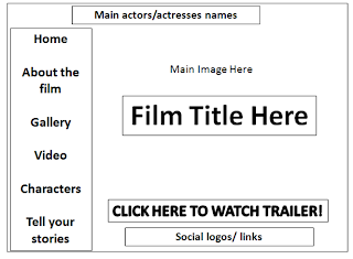
Below is one of the template layout I produced early, I have chosen to develop my webpage design from this layout.
My Designs:

Photograph's for Webpage Design

In order to design my wepage, I have taken a range of photos and picked the three best ones. Below are the three photographys I have picked, next I will edit these photos to make them more effective on the webpage.

Photography one:
First Photography being edited:
I have edited both the brightness & contrast levels, this has allowed me to make the photo more effective, as I am able to make to photo darker and more gloomy, therefore making the photo fit the horror theme better.

Photography Two:

Second photograph I edited:
For this photography I changed the colour of the settings to black and white, as the orginal photo had a slightly blue tiny, which did not flow well with the webpage template design.
Photography three:
Third photography I edited:
For this photography I changed descreased the brightness and increased the contrast levels, therefore making the image dark and bolder, therefore making the photography more effective.

Inintal Webpage Designs

To begin my webpage design, I have created three different layouts. I used my research from currect horror webpages to help me to create these designs, to ensure my webpage would have all the right links, to create a successful webpage.

Poster ideas developed from initial ideas

After taking a range of photographys for my poster ideas, I have decided to base my model on the young and volnerable character from our film idea. I have chosen three photographs to produce three different posters. The fonts and placements are only first drafts therefore they can develop and change as the poster moves on.

Below
are my poster designs and the orginal photographys used below, to show how they have been edited to make the poster more effective.

Poster design one:
Orginal photography:

Poster Design two:
Orginal photography:

A few photographs for Poster Designs


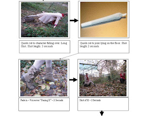
Storyboard